
most cleansers out there are in a bottle with a triangle or rectangle shape
facial mask -

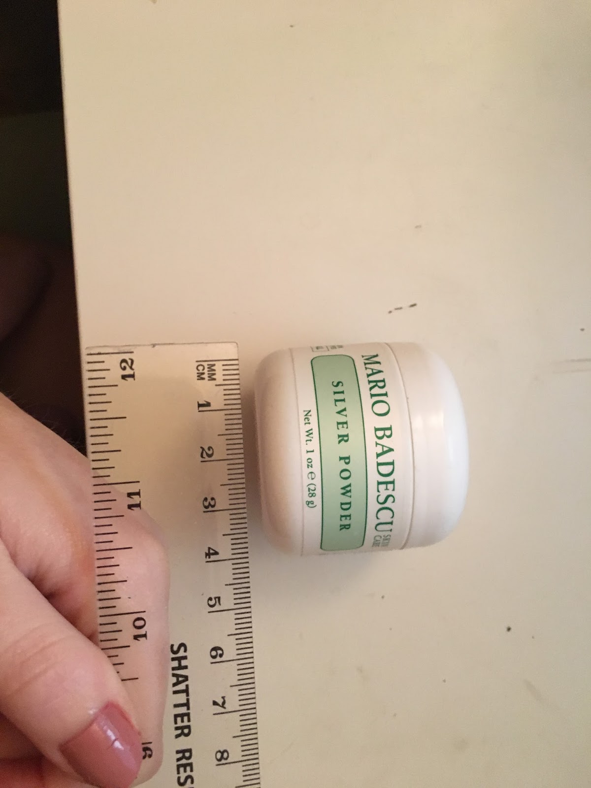
facial masks are either sold in tubs or small packets
moisturiser -

moisturisers are packaged similarly to cleansers in a tube bottle
exfoliating scrub -

again the scrubs come in tubes or bottles
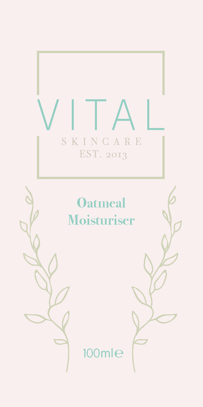
I am therefore going to be designing the packaging for 3 tubes and one tub. The way i am going about it is to design a minimal sleeve that would be wrapped around the bottle itself rather than printing right onto it. I will base the sizing from products I have as they are standard size, both packaging features just front and back design as there are no straight sides or enough surface space.


I decided to use a list of ingredients from a product found from the internet just to show the effect. Initially I started to design with the colour palette chosen however soon discovered the colours are too light to really stand out and be able to read in font, I also wanted to design to a background according to bottle colour so the design must stand out. I used the same colours just darkened the shade.

When it came to mocking up the products I didn't struggle with the tube designs however the tub proved to be difficult as of its long width and small height, to have all the information and match the style of the other designs was hard.


These are three options I tried but finally settled on the one below, incorporating the square with the whole title rather than just the logo. All of the design use two basic colours for the text and illustrations, with a third used to show the background.


I also decided to add some appropriate symbols to the packaging.
The use before - Most products have a Period After Opening (PAO) symbol - as shown in the image above - which acts as a guideline for when you should throw out a product after you've opened it. The symbol includes the letter 'm' which stands for month and a number before the letter 'm' (which stands for the amount of months), i.e. '6m' means that once you've opened a product you should realistically stop using this product after six months.
The e on the front -In the European Union, a lowercase “e” is the estimated sign (sometimes called an e-mark), which indicates that, across all of the cosmetics manufactured, the average volume or weight of the products is the same as the number on the label, per EU law.
The LDPE - Plastic #4 – LDPE (Low Density Polyethylene) Low density polyethylene is most found in squeezable bottles, shopping bags, clothing, carpet, frozen food, bread bags, and some food wraps. Curbside recycling programs haven't been known to pick up this plastic, but more are starting to accept it.
Bunny - In the animal rights movement, cruelty-free is a label for products or activities that do not harm or kill animals anywhere in the world. Products tested on animals are not considered cruelty-free, since these tests are often painful and cause the suffering and death of millions of animals every year.
No comments:
Post a Comment