BLURRING THE GENDER LINES: Progressive packaging that doesn’t alienate consumers
The awareness of fluid gender identities has gathered momentum over the past few months. Traditional gender roles are gradually being dismantled as mainstream media has opened the conversation surrounding people who are outside of the gender binary; because of this brands need to keep up with progress in western society and sexist marketing is no longer relevant for younger consumers who have grown up in a world of gender equality.
"Being a stay at home Dad, I went to buy my kids their first teenage personal care products. Having seen the rows of products, pink, pouty and submissive packaging aimed at my daughter and steel grey, macho stuff intended for my son, I left determined to do something about it.
I went back to school, studied cosmetic science and have formulated a unisex range, specifically for adolescent skin and hair."


The design of all of this packaging is very simplistic using just one colour, typeface and different colours for the different products. Although the design is simplistic it would stand out on the shelf and be suitable for anyone to pick up and feel comfortable buying. When it comes to cosmetics the main thing you want to get across about what is inside is it is safe and does the job, the clean feel of this packaging works perfectly for this.
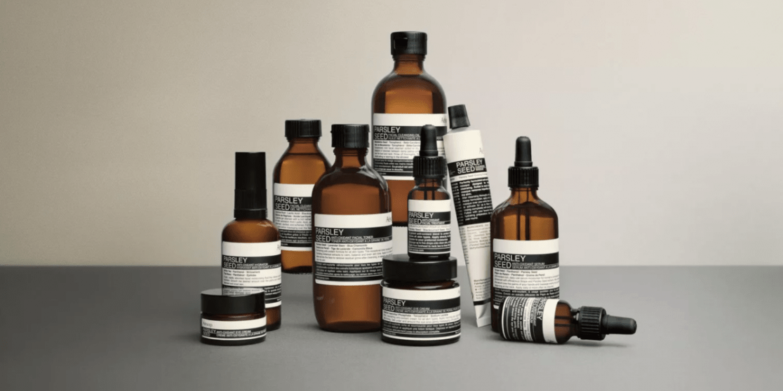
Established 28 years ago, Aesop is an Australian skincare brand that proves that personal care products do not need to fall into the trap of gendered stereotypes. Aesop’s beautiful packaging is not restricted by the traditional design rules for beauty and cosmetics products – their dark bottles look more like alcoholic spirits than toiletries. Their unisex products and formulations cut across the gender divide and highlight the power of effective, high-quality design.

"We believe unequivocally that well-considered design improves our lives.
A sincere interest in intelligent and sustainable design extends to every aspect of Aesop’s workings. Just as meticulous research is integral to the formulation of each product, our utilitarian containers are created with utmost care to ensure they function with ease and are pleasing to our eyes."
This beauty and skincare brand from the US is not only committed to totally organic and sustainable products, but it is also markets its “no frills skincare” to both men and women.

The stripped-back, simple design takes cues from food and drink packaging in its efforts to reinvent the personal care category.
"It's about simplicity. Our whole thing is that fewer ingredients means gentler skincare. And the simpler your routine the better. Our products are effective, easy to use, and made for everyone. It's about you. The beauty industry desperately needs a makeover. We’re a small team of real people just like you: we want products that really work and we don’t want to feel bullied into buying them."
No comments:
Post a Comment