Does gender stereotyping in product advertising/packaging alienate consumers in a society with a growing awareness of non-binary people and gender equality issues
This essay will explore gender stereotypes, the reasons for them, examples of them in use in advertisements and products, as well as taking a look at companies at the forefront of unisex and gender neutral products. However before any discussion of this question, it is essential to first outline some of the key terms related to the topic of gender queer (another term for non-binary) as a lot of people are misinformed or do not understand. Sex is one's biological sex i.e. whether they were born male or female. Gender is roles or behaviours one would pick up through socialization as the sex they were born, in accordance to feminine and masculine. Sexuality indicates someone’s sexual preference such as being heterosexual, bisexual, homosexual etc. To be gender fluid means a person does not identify themselves as having a fixed gender, they could fluctuate multiple times a day or just every now and then. Androgyny is a gender expression that has elements of both masculinity and femininity at the same time, both this and gender fluid fall under the umbrella term of non-binary also termed genderqueer which is for gender identities that are not exclusively masculine or feminine—identities which are outside the gender binary and cisnormativity. Cisgender simply means a person whose gender identity and biological sex assigned at birth align e.g. man and assigned male at birth.
As a lot of society is becoming accepting of people for who they feel they are, sexuality and gender is becoming less static, unlike sex which is biological and apart from a few rare cases there are only two options, there are mass amounts of genders people can now identify as. It is hard to believe that with this fact there are still countless advertisements and products designed to be aimed towards one specific gender. The way they are designed however is not to a gender, but an outdated stereotype based on sex. There are a lot of things that ‘influence the understanding of gender and attributes that are by and large associated with femininity and masculinity, they change over time and are bound by religion, ethnicity, social status, geographical region, etc’ (Popova, 2010).
We tend to learn stereotypes from a young age from our parents as they are our first and most influential teachers, then through our peers and the media. We are comfortable in believing and not questioning these stereotypes when we are young because people like or rather need to categorize the physical and social world into groups that make sense. There are a few different reasons for this, primarily being what Bandura calls “Social Learning Theory” he says ‘Most human behavior is learned observationally through modeling: from observing others, one forms an idea of how new behaviors are performed, and on later occasions this coded information serves as a guide for action’ (Bandura, 1977). In terms of psychology, our mind is considered to be a cognitive miser (The term cognitive miser was first introduced by Susan Fiske and Shelley Taylor in 1984) this is due to the tendency of humans, regardless of intelligence, to think and then solve problems in the most simple and effortless ways rather than more effortful ways. So therefore categorizing people allows one to no longer consider individuals in a group, but instead apply the general group information to all of its members. This in turn diminishes the need to understand or predict any individuals as this information on how they will act is contained within a stereotype. In theory stereotypes save time and money when it comes to companies developing new products as they don’t have to consider individuals, however with the amount of people identifying as non-binary and therefore falling into no such stereotype is on the rise, issues are starting to arise. Having said this it is not just those who identify as non-binary left feeling alienated, cisgender people should not be presumed for what they are either, your sex in no means defines what products you are interested in.
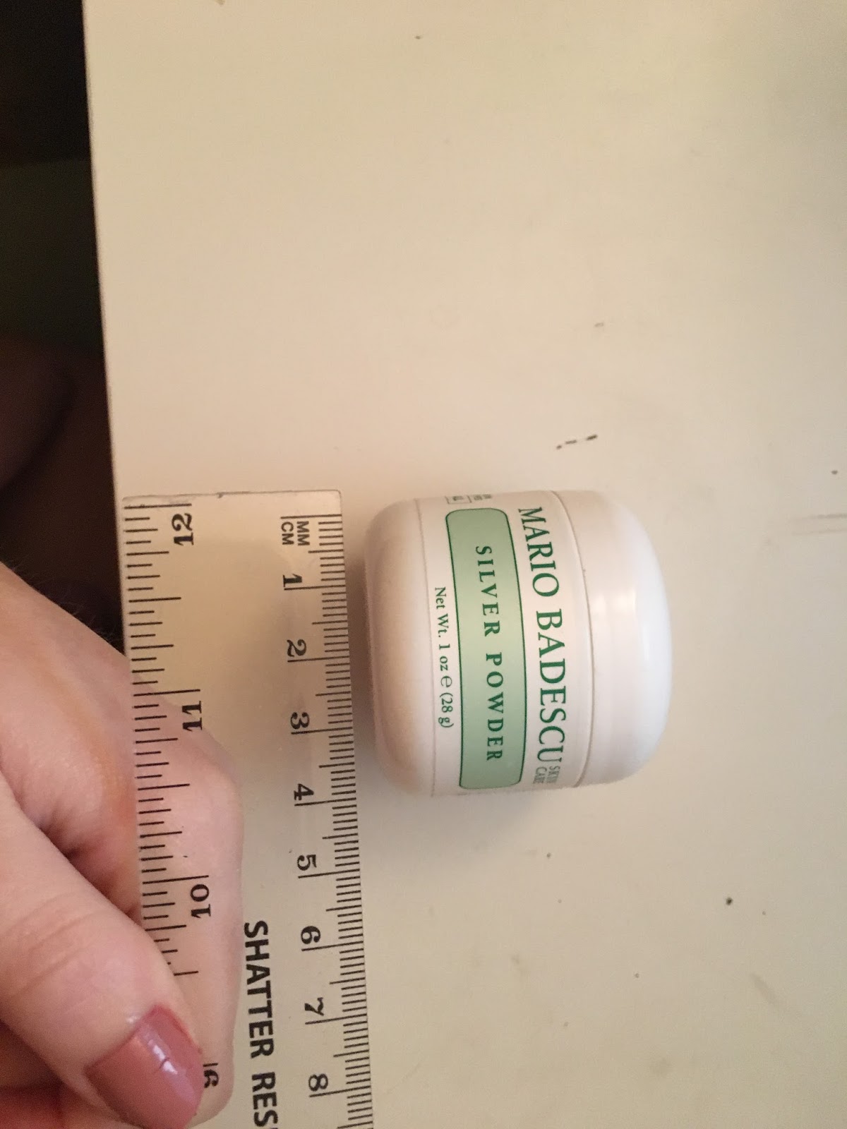
Following are some examples of gender stereotypes that many young children are aware of, typical activities/interests for girls: drawing, dolls and dancing. Typical colours: pink and purple. Typical professions: nurse, teacher, stay at home mother. Whereas for boys typical activities/interests include: football, toy cars and the army. Typical colours being blue and green, with professions such as doctors, firefighters and pilots. In terms of packaging, say for example of cosmetics/toiletries most women’s products are white or pale in colour featuring floral designs and thin delicate typefaces, whereas mens features darker colours such as black/blue and bold typefaces (see figures 1 and 2). As looking after your appearance and using cosmetics is seen by gender stereotypes as a more feminine thing, a lot of mens products are designed to be ‘masculine’ using stereotypes to almost convince and assure men it is okay to use them. As previously mentioned a contributing factor to gender stereotypes, probably the most impactful once we are adults is media advertising and television/films ‘Socially constructed. Most of the behavior associated with gender is learned rather than innate’ (Chandler, 2008).
Having explained the reasons stereotypes exist and giving some examples, it is time to look at the impact they have on society and some of the controversies caused. Since the start of the 21st century people’s mindset have changed considerably on gender and more specifically the role of women, and what they are capable of/ entitled to. There is of course a lot of masculine stereotypes that are played on however the most research on gender issues in advertising focuses on the portrayal of women rather than men. This is for the simple reason that women are depicted as the weaker sex, they are passive and easy to manipulate with their main concerns in life being their looks and upbringing of their children along with the well-being of their husband. In contrast with how men are seen to be a lot more intelligent and capable of multiple responsibilities, which is misogynistic as women have not abandoned those traditional roles of house maker and taking care of themselves but have succeeded in typical ‘male’ jobs . This fact however works both ways with a lot of men becoming stay at home fathers and being a lot more metrosexual. Another issue within advertisement of products is the objectification of women. (See figure 3) Swim and surf brand Billabong released this advert which in short uses the man surfing as a subject, whilst the woman lays seductively on the beach as an object. This kind of advert is harmful to impressionable children as it promotes boys to believe their sex is all about the fun and being active whilst women just sit there looking pretty, and in reverse could leave young girls unsure on activities as it is ‘something boys do’. There were a lot of complaints about this particular advert and it ended with Billabong replacing the second image (see figure 4). There has since been a review by the Advertising Standards Authority (ASA) called Depictions, Perceptions and Harm which looks at harmful gender stereotyping in advertising, ‘The ASA has ruled against ads that objectify or inappropriately sexualise women and girls, and ads that suggest it is acceptable for young women to be unhealthily thin, usually using rules on offence and social responsibility.’ (ASA, 2017) The review also provides an evidence-based case for stronger regulation of adverts that feature stereotypical gender roles which can be harmful to people, for example those seen in figures 5 and 6. Figure 5 is a GAP advert featuring a boy who will grow up to be an academic, whilst the young girl will go on to become a ‘social butterfly’. Figure 6 is a still from a video advertisement from the formula company Aptamil which shows three babies as youngsters exploring and later growing into their careers, the baby girl is seen to grow into a ballerina, whilst the two baby boys have futures as engineers and mountain climbers. This is harmful for both sexes as children must be taught they can grow up to any profession they want regardless of their sex and sexual orientation. The ASA have also released a report based on qualitative research for gender stereotyping in advertising ‘Views amongst children (including teens, tweens and parents of preschoolers) and adults were generally similar. Overall, adverts were not felt to reflect modern-day society and the depictions of men, women, families and relationships in advertising were felt to be generally clichéd and stereotypical. These stereotypes were generally not considered offensive or harmful, but rather uninspiring and lacking diversity, and suggested that the advertising industry is behind the times’. (ASA, 2017) The report was conducted in order to gather the views of the general public on different advertisements which feature gender stereotyping amongst other issues such as body image and mental health, the results will help the ASA regulate advertisements.
It is not just advertisements for products that show gender stereotyping and sexism, it is the actual products themselves, with countless ‘for men’ and ‘for women/ladies’ products lining the shelves of shops. There have been many controversies on both sides for example, products that are used by both sexes are often redesigned in pink for women, the bic range ‘for her’ is an example (see figure 8). Bic received a lot of backlash from this product as people questioned why women needed a pen that was pink or purple in colour, are they not capable of using a standard black design? There are a lot of products designed, rightly or wrongly for women which will not stop whilst consumers still buy into it, however to clearly state ‘for her’ is outrageous. The majority of ‘for her’ products are those used by both sexes, but product developers think women would prefer them to be more girly and almost dumbed down as though they aren’t capable of the unisex/masculine version. Whereas when it comes to ‘for him’ the products are often made to feel a lot more masculine, for those who aren’t secure within themselves to use products that are seen as more feminine or even just unisex. Take this Axe shower sponge (see figure 9) actually labelled ‘shower tool’ on their website rather than being a sponge, obviously available in blue, black grey and red. As much controversy comes from these kind of products being released, they are still highly popular and a lot of people aren’t offended as seen in the results of the Gender stereotype packaging survey, when asked ‘Do you think products claiming they are specifically 'for men' or 'for ladies' are patronising/alienating?’ 45% of the 35 people answered ‘No’.
Pink for girls and blue for boys hasn’t always been the norm in society, back in 1884 Franklin Delano Roosevelt can be seen (figure 7) wearing a white dress with shoulder-length hair, at this time it was social convention for boys to wear dresses until the age of 6 or 7, around this age would also be the time of a first haircut. Nowadays baby’s are dressed in pink or blue from birth to ensure other people are aware of their sex. ‘Pink and blue arrived, along with other pastels, as colors for babies in the mid-19th century, yet the two colors were not promoted as gender signifiers until just before World War I—and even then, it took time for popular culture to sort things out.’ (Maglaty, 2011). In the 1940s manufacturers settled on pink for girls and blue for boys, so Baby Boomers were raised with wearing the two colors and a factor in the success of this was prenatal testing, once expecting parents learned the sex of their unborn child (this came in around the mid 1950s) they would then shop for ‘boy’ or ‘girl’ merchandise and Paoletti, author of Pink and Blue: Telling the Girls From the Boys in America says ‘The more you individualize clothing, the more you can sell’. After being brought up wearing specific styles and colours in clothing and having our rooms decorated accordingly, it is no wonder society as a whole still responds to gender specific products and packaging. Research conducted by easyFairs on 500 marketing and packaging professionals found that gender specific packaging had greater influence on women. When asked about whether they thought gender cues in packaging would sell more products 42% of those polled agreed. When it came to children’s packaging – i.e. pink for girls and blue for boys – 40% claimed this responded to what girls and boys prefer, with 29% claiming a company would lose sales by adopting gender neutral packaging. More than a quarter (28%) think gender specific packaging is a good idea, with over 39% revealing they have considered integrating pack gender bias as a way of improving sales. A third (33%) though said an increase in gender-neutral packaging was likely to be on the cards following campaigns such as ‘Let Toys be Toys’, which canvasses for the removal of gender labels from toy packaging, ‘Let Toys Be Toys is asking the toy and publishing industries to stop limiting children’s interests by promoting some toys and books as only suitable for girls, and others only for boys.’
There are numerous brands that refuse to design their products based on gender stereotypes and therefore have packaging that anyone could identify with and feel comfortable buying and using. Sam Farmer (see figure 10) for example, ‘Being a stay at home Dad, I went to buy my kids their first teenage personal care products. Having seen the rows of products, pink, pouty and submissive packaging aimed at my daughter and steel grey, macho stuff intended for my son, I left determined to do something about it.’ He decided to study cosmetic science and now produces a unisex range which is designed specifically for adolescent skin and hair, with no specific gender being targeted. Other brands aren’t consciously taking a stand against gender specific packaging however feel that products don’t need to fall into categories specified by gender stereotypes. Aesop was established 28 years ago and their unisex products and formulations cut across the gender divide and highlight the power of effective, high-quality design (see figure 11). From their website ‘We believe unequivocally that well-considered design improves our lives. A sincere interest in intelligent and sustainable design extends to every aspect of Aesop’s workings.’ Other examples of cosmetic brands whose packaging is accessible to everyone is Carmex and Burt’s Bees (see figures 12 and 13), the key is simplicity in packaging and using colours relevant to the ingredients and history of the brand itself rather than who it is for, everyone gets chapped lips therefore consumers will always buy and are likely to go for a trustworthy looking design.
From a business point of view gender specific packaging is still a good idea as society buys into it and companies sell more by designing two separate of the same products, there is however a lot of controversy and a fine line between it being aimed towards a sex and being sexist. The media will continue release advertisements and packaging featuring gender stereotypes for the time being however awareness of how unnecessary this is is rising thanks to campaigns such as ‘let toys be toys’ and regulations being put in place by the ASA. As seen in the Gender stereotype packaging survey 31% of the 35 people aged 18-24 asked said they would not feel comfortable buying toiletries such as deodorant clearly designed for the other sex, which is an issue as there are often price differences and people should be comfortable to buy what they please. In terms of people who identify as genderqueer, the existence of gendered products shouldn’t be much of an issue as there are enough gender neutral/ unisex products out there however if we as a society want everyone to be truly equal, products should be seen as accessible to everyone.