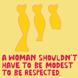
I decided to use the colours I originally experimented with when using water colours, I feel this makes the images a lot bolder and they therefore grab the viewers attention more so than the pastel colours did. The combination of the bubbly uppercase letters and the simplistic illustrations get straight to the point and are understandable, this is vital in the age of social media when people's attention spans are shorter and you don't have enough time to gain intrigue.


No comments:
Post a Comment