Tuesday, 27 November 2018

Tutorial 03


Having started my essay thoughts on what I am going to produce for my practical have started to come about. The response to my essay will be a poster series of at least four, on topics that are relevant to fourth wave feminism.

Whilst writing the essay, the structure and question have also slightly changed, below is what it was originally:

"To what extent has graphic design helped the feminist movement on the course to equal rights?"

  • Feminist history - political, social (the vote, abortion rights etc) (how society views women)
  • How design was used to promote the movement and protest
  • Successful changes - more job opportunities (less stay at home mothers)
  • The history of graphic design - the focus predominately male / women aren't featured in books, magazines, in exhibitions
  • Lot of progress but still unequal - pay gap/ underrepresented/ percentage in higher roles
I have now changed it to: How have graphic design and visual arts been a part of the feminist movement on the course to equal rights? The reason for this is that I wanted to be able to include installation art and other aspects that are really relevant to the movement in terms of art and design but don't quite fall under the label of graphic design.

The structure has also changed:
  • intro
  • first wave feminism history
  • first wave feminism art and design
  • second wave feminism history
  • second wave feminism art and design
  • third wave feminism history
  • third wave feminism art and design
  • fourth wave feminism history
  • fourth wave feminism art and design
  • conclusion
The previous structure included topics that weren't necessarily relevant to the question in hand, through the essay I will also discuss anti feminist pieces.

Women Of Design - Bryony Gomez - Palacio & Armin Vit

Surging within the unsympathetic, male-inclined business and academic environments of the 1960s, 70s and 80s, these designers defined their own berths in a fledging graphic design profession and cultivated an instrumental body of work that would influence future generations. Now, with decades of experience, through sustained practice and career that have lent them firsthand accounts - even leading roles - of the numerous changes in the profession, their contributions are incisive, authoritative and salient as they continue to exemplify the creativity and business acumen that represents the best graphic designers today.

Katherine McCoy

More than forty years ago you held your first design position at Unimark International, a paragon of the then-new corporate modernism. How formative was this first experience?

I was very excited to join Unimark International as a junior designer after college graduation. It was an exceptional way to begin one's design career. Unimark was like graduate school for me. 

The Unimark designers were excellent, and I learned a great deal from them. I had the opportunity to work with two Swiss graphic designers, Harry Boiler and Peter Tuebner, who were my first sources of knowledge about the Swiss grid system. I watched their every move! Massimo Vignelli, a Unimark vice president who headed their New flew York office, flew in Periodically to discuss projects.

The Unimark clients and projects were high quality, well-funded and challenging, allowing us the opportunity to do our best work. 

The Unimark designers had books that I had never seen before—the Swiss "bibles" by Muller-Brockman, Karl Gerstner, Armin Hofmann and Emil Ruder. In 1967 these books were only available in one bookstore in the United States George Wittenborn in New York City. I photocopied each entire book after-hours on Unimark's photocopier! 

Unimark was very demanding. We all worked very long hours, often over sixty hours a week. But we were highly motivated by a missionary zeal to improve the design quality of the built environment in people's lives. The state of design in the U.S. was pretty awful in the 1950s and 1960s, and we wanted to clean it up. The highest compliment one could say about a design was, "That is really clean!" Clean meant minimalist, modernist form based on an objective and systematic problem-solving process. Sans serif typography (Helvetica and occasionally Univers) on a grid was always a key element. The Unimark office had a bank of flat files filled with Helvetica 
transfer lettering. 

After working at a few other design firms, you and your husband, Michael, and industrial designer, set up your own outpost, McCoy & McCoy. This collaboration has stood, to different extents, since the 1970s. How have you been able to maintain it? Do you separate business from pleasure? 

Michael and I met in our university's industrial design studio, so we shared a passion for design from the beginning. We married two weeks after my graduation, and it was natural to continue sharing our design enthusiasm. I brought things home from Unimark constantly and we poured over them. Mike began his own studio at that time, and it was natural that I worked on those projects with him after-hours. When we began at Cranbrook, we formalised our partner-ship as McCoy & McCoy. 

We've always lived and breathed design. We do take time off from design, although not in a formalised or structured way. Design is not just from 9 to 5 with personal life in the evenings. Our work lives and personal lives are more fluid and less formally structured than many people's. Our individual design interests and abilities seem complementary. Because we each know a lot about the other's work, we are able to support and assist each other, and celebrate each other's accomplishments. Over the years, we have found that it is healthy for each of us to have our own focus and build our own reputation in that. Then, when we collaborate, we both have the the maturity to be equal contributors. 

When we were first out of school, it was very important for me to build my own 1 career and establish myself as a designer independent of my husband. This was the late 1960s when there were few women in design. In fact, except for a six-month period, I was the only female designer in each place I worked. And at Cranbrook, I was the only woman on the faculty for almost twenty years. I worked for four different design firms and studios before Cranbrook, and I gained valuable experience from each. I've always enjoyed working in organisations, whereas Mike has always preferred to work independently. I have also devoted many fruitful years to work and leadership in professional design organisations—the Industrial Designers Society of America, the American Institute of Graphic Arts and the American Centre for Design.

Paula Scher

With an unparalleled typographic approach that can adapt and thrive in a perplexing number of applications - record covers, staircases, air-conditioning ducts - and for an enviable range of clients - Citibank, Tiffany&Co, and The Public Theatre, to name a few - the work of Paul Scher has surfaced the top of the profession for more than three decades. She started in the music industry at CBS Records and also briefly at Atlantic Records, then broadened her scope of work in the mid-1980s through her own studio, Koppel and Scher. She has been a partner at Pentagram since 1991, where her energetic deign has fully developed into a multidisciplinary portfolio.

Sheila de Bretteville

For the last three decades, de Bretteville has been cementing her legacy in design education: First in the 1970s as the founder of the Women's Design Program at the California Institute of the Arts; then in 1981 as the initiator of the communication design program at the Otis Art Institute of the Parsons School of Design; and since 1990 as professor and director of graduate studies in graphic design at Yale. During her academic career, de Bretteville has produced work that embraces user participation and the effect the work has on local communities - her celebrated work in the public art realm reflects this sensibility by weaving itself into the neighbourhoods it inhabits.

Saturday, 24 November 2018

The long-lost suffrage protest posters used to fight for women’s rights

Lucy Delap, a historian and lecturer in modern British and gender history at the university.

“Collections like this help us to understand how design can be used for a political cause,” says Delap. “They influenced women’s protest, and other protest, throughout the 20th century, such as the feminist posters of the See Red Women’s Workshop, which ran from 1974-1990. That poster tradition has carried on.”
While this exhibition is focused on the printed poster, this is not where political suffrage paraphernalia ended in the early 20th century. Postcards were handed out, magazines were disseminated, banners were waved at marches, and organisations even had their logos and brand colours printed onto merchandise such as teacups and pens.
The suffrage movement was very interested in how to link colour schemes and logos with politics,” Delap says. “Really, it was at the forefront of visual branding.”
And we only need to look to social media to see that the suffrage movement’s witty, dry and brutal poster design continues to influence political movements today, she says.
“Whether it’s a hand-drawn poster in 1910, a zine in the 1990s or memes on Instagram today, images continue to be a really important part of political engagement,” Delap says. “A witty, speedy, visual response is still the best thing you can do to make a political point.”

Thursday, 15 November 2018

Women are studying design – so where are all the female creative directors?

In her first column, Kerning the Gap founder Nat Maher looks at how female designers face career progression challenges and lack of exposure – an inequality that was revealed to her through a simple Google search.

By Natalie Maher April 21, 2017 6:24 pm

If you’re a woman in design, I recommend you have a large gin before you type “famous graphic designers” into Google. If you do it, check out the image carousel that pings up at the top of your results. Sure, I’m girl-crushing on Paula Scher as much as the next woman, but after five spins of the carousel, it shows me just five women out of 50 people.

Then again, at the last count, only 11% of creative directors in our industry are women. Given this ratio, Google (as ever) is pretty much spot on.

At Kerning the Gap, we’re trying to change these ratios, and get more women into leadership positions across the entire spectrum of disciplines in the design industry.

We’re constantly seeking to better understand why this is such a challenge, so that we can smash the status quo apart and create some real and tangible change. And with such an energised collective, we’re already gathering momentum.

The question we rarely stop to ask though is, why was it ever thus? Weren’t there any women designing when Paul Rand and Saul Bass were defining the craft?

The majority of design students are women – so where do they go?

Preparing for a talk at Ravensbourne on the history of women in design, I was dismayed to discover that work from female designers only accounts for 30% of the design curriculum at London’s Central Saint Martins (yet 70% of its students are women). The Guardian also reports that art and design degree courses in general are dominated by women. Yet a Design Council survey shows that only 40% of professional designers are female.

The thing is, they were there: the Nike swoosh; the original A-Z (look up Phyllis Pearsall – her story is amazing); the UK’s road signs; and the 1984 LA Olympic Games identity – they just never had the profile.

Without turning this into an essay about the evolution of the design industry, the industry we know and love today has some roots in the arts and crafts movement, where women were not only present, they were actively encouraged to embrace it as a “wholesome” pursuit. But, being as things were at the turn of the century, they were not allowed to hold any official memberships. Their “supporting role” was ingrained from the outset.

Moments in our feminist history, such as poster creation for the women’s Suffrage movement in the early 1900s, gave women designers their first foray into full creative control. Then, of course, war, and the world of work for women changed forever. We had kept the country going, and we were NOT going back. Introduction of the pill in the 1950s boosted our pay equality by 30%. Then we campaigned and got the Equal Pay Act in 1970 (granted, that has been in place for 47 years and women are still 18% behind – but that is a matter for a whole other editorial column).

Only 11% of design business leaders are women
So, here we are in 2017, political, biological and economic barriers have been gradually trampled down and, much like the good old arts and crafts days, we have no trouble attracting women to our industry. And yet, we still can’t seem to get more than 11% of them to the forefront.

So why don’t we get profile? Well, if you haven’t read Lean In by Sheryl Sandberg, then buy it now. Its mantra of “We’re holding ourselves back by not raising our hands, and by pulling back when we should be leaning in” is an important truth and I have yet to find a woman who has not identified with it at some point. Combined with this, women are less likely to build their networks or take platforms to speak, and we tell ourselves “how lucky we are” and continuously settle for what’s on offer rather than push and negotiate. I’ve done all of these things in my career.

Thankfully I found excellent role models, mentors and sponsors, who believed in me and pushed me to do more, and who still do. And I now have my own mentees, who constantly teach me in reverse.

Men need to join the debate

And that’s where I think the mantra of “Lean In” needs a counter-balance. I feel uncomfortable, particularly as a leader of a design business, demanding that women take all of the responsibility for solving workplace inequality on their own. Sure, the need to push, question and self-improve is vital, but all people have the responsibility to create workplaces where those women can flourish. To become the mentors, sponsors and role models.

Half of the challenge we have – 89% of it, in fact – is the current lack of women in leadership positions, who act as vital role models, and bring first-hand experiences of their own challenges to help reshape the legacy behind them. Thus the cycle perpetuates. It’s a fundamental part of why Kerning the Gap is a gender neutral collective. Men aren’t the enemy – far from it.

We urgently need men and women to be equal parts of the solution. Whatever your gender, if you’re in a leadership position, you need to ask yourself if you’ve pulled the ladder up behind you; if you’re doing everything you can to boost diversity (of every form) in your leadership team; if you’re mentoring the next generation to get that bloody carousel looking more balanced.

And if you’re an aspiring leader, reach your hand up. Expect more. Call it out. Build your own bloody carousel, if you have to. Kerning The Gap is here to champion you.

Kerning The Gap is a collective of like-minded people who want to see more women in design leadership roles, hear their voices and be inspired to create change.

Wednesday, 14 November 2018

Eye Magazine: Katherine McCoy

Katherine McCoy was born in Decatur, Illinois, in 1945. She studied industrial design at Michigan State University before joining Unimark International in 1967. She went on to work at Chrysler Corporation and Omnigraphics, Inc. In 1971, McCoy became co-chair, with her husband Mike McCoy, of the design department at Cranbrook Academy of Art, which they continued to direct until 1995. By the 1980s, their sometimes controversial programme had established itself as one of the most innovative in American design education, producing a stream of graduates who have gone on to make their own mark in the profession. Their company, McCoy & McCoy, has worked in two- and three- dimensional projects for Formica, Xerox, Unisys, MIT Press, Philips, Tobu Stores Tokyo and other clients. McCoy is a past president and fellow of the Industrial Designers Society of America and an elected member of the Alliance Graphique Internationale. She is president of the American Center for Design and recently completed a term as vice-president of the American Institute of Graphic Arts. She served on the Design Arts Policy Panel of the National Endowment for the Arts and chaired the Design Arts Fellowships Grant Panel. In 1994, the McCoys were jointly awarded a Chrysler Award for Innovation in Design. ‘Cranbrook Design: The New Discourse,’ an exhibition of work by McCoy, her students and graduates, travelled to New York and Tokyo in 1991. She has written widely about design and education, and her teaching methodology has featured in many international publications, including Eye (no. 3 vol. 1). 

Rick Poynor: What attracted you to design?

Katherine McCoy: I wanted to be an architect, but this was the early 1960s and the male high-school counsellor said, ‘Oh, you wouldn’t like architecture, it has too much math. You should be an interior decorator.’ Industrial design was the university course that covered interior design. When I got in I discovered this whole discussion of problem-solving. For the first project we had to do 50 thumbnail sketches before we could go any further – 50 alternative concepts! – and I thought, ‘This is the way I want to approach my life. This is the way I think about life.’ It was so natural after trying other directions and thinking I was an artist, and the high school teacher trying to turn me into a painter.

RP: How did you make the move from industrial design to graphic design?

KM: I’m really grateful that I have a foundation in industrial design because graphic design still isn’t taught with much conceptual methodology other than the ‘Aha!’ method of intuition: have your brainstorm, get the idea and then turn it into form. Industrial design has so much more method to it. I discovered typography in the course of industrial design. I took one graphic design course at university, but it was a really weak programme: ten weeks of Chancery Italic calligraphy. It didn’t seem to make a lot of sense, but I began to develop a love for typeforms.

I graduated with an industrial design portfolio that included some interiors and graphic design. My first job was with Unimark International, which was fortunate because it was interdisciplinary and that is what I wanted. The bulk of our work was corporate identity and I learned graphic design from several graphic designers in Unimark. It wasn’t the ideal training because there was no formal structure, but it was very valuable because the designers were so good. I found I had a natural affinity for the logic of grids. Unimark was dedicated to what they called European design. Basically, they were bringing Swiss graphic design to the US, based on rationality and systems, objectivity, clarity, all those things inherited from the Bauhaus. It felt right with my earlier attraction to problem-solving. It was the way I wanted to see the world.

RP: You became co-chair at Cranbrook with Mike McCoy after just five years of this. Did you have an early ambition to teach?

KM: No, I never wanted to teach. The subject came up every once in a while – Mike would bring it up – and I was sure I didn’t want to do it. The position at Cranbrook really just fell into our laps. It was something you could never have thought out, or planned for. On the other hand, when I look back on it, both Mike and I began having students in the studios where we were each working. Working for Chrysler Corporation after Unimark, I had a friend who would keep bringing his design work over to me, and I’d keep slapping his hand: ‘No! You used too many point sizes here, you violated the grid there!’ It was relatively easy to teach graphic design because there were these nice rules. So it was fairly natural to start teaching and I do find I always have an urge to teach. Even with ice-skating, which is an enthusiasm of mine, I find myself teaching people who just know a little less than me.

RP: What kept you at Cranbrook for such a long time – 24 years?

KM: That’s a long time, for sure, but at this point I could never see myself not teaching, because you learn so much! I’m totally convinced that the teacher learns the most! So that’s my motivation for teaching – it is almost self-interest. It is so stimulating, it challenges you to grow.

Why stay at Cranbrook for so long? Because it is such a flexible situation. At Cranbrook a department chair is everything from teacher to janitor to alumni relations director. There is no one to argue with about philosophical direction. If you want change, you can change. The only real requirement from the administration is that you attract good students and produce strong graduates who find their way in the profession. So we have turned a lot of corners over the years. We kept getting interested in new things and the programme kept growing. It wasn’t just from changes that we made, but also from new directions initiated by the students. They kept evolving and becoming interested in new things, so it was constantly changing.

RP: Why are you leaving now, given that it turned out so well?

KM: The cost of all that teaching freedom at Cranbrook is that it is a very intense, demanding situation for nine and a half months of the year. I have experienced whatever revelations come from being in charge, being responsible for a whole programme. In that sense there is nothing left to prove to myself. I would now like to teach in a place where someone will just hand me some terrific students, and drop into a stimulating programme, while being more free to do other things. I would like to write more and have more time for personal work at our ‘electronic cottage’ in Colorado. We are planning to teach at Chicago’s Institute of Design at Illinois Institute of Technology for one semester a year. This could be seen as a change of environment for us, since many have characterised Cranbrook as the art of design and ID as the science of design. But the commonality we see is the cultural function of design – the cultural human factors of objects and communications.

RP: What sort of students has Cranbrook attracted over the years, and what are they looking for when they come to you?

KM: One of the first things we felt we needed to do when we began teaching at Cranbrook was to define what we had to offer and, in a sense, define our market to attract the kind of students we wanted. I really enjoy working with mature students in their mid-twenties and early thirties – we have also had some very mature students! – with some professional experience. A strong undergraduate foundation in design is good but, on the other hand, some of our most interesting students come from very different backgrounds and found their way into design informally, on the job, and are now looking for a more structured experience to focus their design work.

We insist that students be absolutely motivated and dedicated to their work, with a lot of initiative. The most important thing is not to know, but to know how to know. We also get very polished professionals who feel as if they have reached a plateau in their work. They have learnt a role and they are practising it, but they want to look inside as well as outside to find a personal voice and vision.

RP: In the 1980s theoretical ideas assumed considerable importance at the Academy. How did that come about?

KM: We always encourage students to read. It is an unstructured programme so we have never had courses with official reading lists. Instead, because of the personal nature of each student’s programme, they independently construct their own focus. We have an ongoing department bibliography, and it has been a long-term project of mine to expand it and keep it as current as possible. It all comes back to my early interest in problem-solving. Part of the students’ goal for the two years is to develop their own conceptual strategies as designers. We encourage them to capitalise on their strengths, to become aware of their natural abilities, but also to incorporate external methods for conceptualising. We are continually looking for additional theories. Semiotics was always something we discussed – not as a major focus, as at Rhode Island School of Design – but trying to make sure the students understood the fundamentals and its potential as a design tool. Also, in the 1970s we brought the structured planning processes developed at Illinois Institute of Technology into the design department.

The department is fortunate to have a really good fine art photography programme next door to us in the same building, where they are also very interested in visual theory. Fine art photography was the first field to apply post-structuralism to visual media, such as the idea that you can read a photograph and decode it. I think a lot of these ideas have been communicated informally by talk between roommates, in studio romances and hanging around each other’s studios.

In the mid to late 1970s there was a move away from minimalism, but it was mainly a formal investigation influenced by people like Weingart and April Greiman. It was not so much a questioning of the conceptual foundations of Modernism as a questioning of its formal expression. By the early 1980s that seemed to be pretty thoroughly explored. Every new group asks itself: ‘What’s the contribution we’re going to make?’ There were a couple of itchy years when students were searching for new approaches and finding little things here or there that didn’t quite come to fruition. But the next direction really began to emerge with the class Jeffrey Keedy was in, around 1984 – a group of avid theory hunters! That class and several in succession, including the class Edward Fella was in, very aggressively searched out and explored post-structuralist theories and philosophy. For a while it seemed like the theory-of-the-week club – structuralism, post-structuralism, deconstruction, phenomenology, critical theory, reception theory, hermeneutics, lettrism, Venturi vernacularism, postmodern art theory – but gradually the ideas were sifted through, assimilated, and the most applicable began to emerge.

RP: I have been told that you resisted some of those ideas at first.

KM: Yes, and I still do! Isn’t that appropriate? Because post-structuralism is all about resistance. The excitement of discovery leads to great enthusiasm and the nature of the lot of these post-structuralist writers is to question all the fundamental values of culture. Frankly, I wasn’t ready to remake my value system completely and I do think that there have been a couple of useful contributions among all those dead white men. I wasn’t sure how all of this was going to fit, plus I was searching for the forms it would take. There is a recent quote of Jeff Keedy’s where he says that I kept asking, ‘But what does it look like? What does this mean in terms of design? How do you make it work as a design tool?’

RP: One of your graduates, Andrew Blauvelt, made a comment recently in Emigre, which I would like to hear your views on. He talked about graphic design as symptom and cure. ‘We had the cure in Modernism. In the other camp, graphic design as symptom, we have Cranbrook.’ Do you agree with this analysis?

KM: It does seem that graphic design should reflect its cultural milieu if it is honest to its time and its audiences. Designers are responsible for a significant part of our society’s cultural production, so I think we have a responsibility to produce culturally current work. If a designer takes a nihilistic view of the cacophony of modern life, then I suppose confused complexity would be an honest expression, although that certainly is not my view.

One thing I would like to point out is that a lot of work coming out of Cranbrook is not formally complex. If you look at the New Discourse book some of the work has only three elements to it. That is not, to me, formally complex design. Most people think of Cranbrook as only doing layered work, but a lot of this goes back to the pre-post-structuralist period – the ‘high formalism’ – although certainly Allen Hori’s work, for instance, continues to be very complex and layered. But the complexity I’m interested in is complexity of meaning. I’m not so much interested in the layers of form as the layers of meaning. The first reading is the ostensible first layer of objective meaning. But what is the second? The third? If you were to live with a poster in your dining room for the next three months, what would you continue to find as you spent more time with it? I think this approach fits modern society because the contemporary world is subtle and complex. Simple black and white dualisms no longer work. Graphic design that tries to make things simple is not doing anybody any real benefit. Society needs to understand how to deal with the subtlety, complexity and contradiction in contemporary life. I also think it is possible and necessary to have both complexity and intelligibility in graphic design.

RP: To say, ‘This is the primary information layer, but there are other layers too,’ is to create a meaningful hierarchy and imply a degree of resolution. There is a fundamental difference, though, between what you’re saying and the student who says: ‘The world is confusing and impossible to make sense and I’m going to reflect this confusion in my work.’

KM: I do believe that the rationalism and objectivity of the Modernist tradition have an important place in the design process. The informational content of a message must be ordered into comprehensible hierarchies, typically the first layer of reading. I teach a method of message analysis in our first graphic sequence project and it is always there in my own work. I think a lot of people assume that because a piece is formally complex, the information will be difficult to penetrate. But if you look closely at a lot of the more pragmatic student printed work, I think you will find that the first layer of content is quite direct and well ordered.

On the other hand, sometimes students assume that there is meaning inherent in complexity itself – if it is obscure, it must be profound. I have a big problem with that.

RP: What is your concern about the ‘deconstructionist’ label that Cranbrook and other recent work have attracted?

KM: Deconstruction is a term originally used by only a few French theorists. When you add that ‘ist’ to it, then it is reduced to a faddish term. ‘Deconstructionist’ now seems to mean forms deconstructed or taken apart, disassemblage. One of the regrettable things about the term is that people who haven’t read about it very deeply conclude that it is just about form and, more than that, that it is about the disassembling of visual language. That is part of the process, but I am interested in the idea of deconstructing the relationship of written and visual language to understand the dynamics and intentions in communication. Analysis is breaking down existing things to understand what is happening. The second half of it is: what do you learn from that? How can you build from there, as a proactive, synthetic strategy? Student experiments search for signposts in their conceptual processes to create new methods of communication. I am interested in discovering new options for our audiences such as the idea of encouraging the participation of the audience, opening up meaning so that they can be involved in the construction of meaning and make individual interpretations. This is one strategy for turning the analytical process into a synthetic process.

RP: Is it possible to produce a genuinely probing contemporary graphic design without addressing theory in some way?

KM: Yes and no. Even the most intuitive designers are influenced by the thinking of their professional milieu. These theories become absorbed by the mainstream so quickly that all these ideas are potential resources. I think of design as a pluralistic activity. Having started out with the big ideology of High Modernism, and seeing the limitations of one theory for all messages and audiences, I am now interested in the more modest idea of looking for pragmatic tools so that each designer can develop an effective personal process. Every designer is an individual. The idea of a designer swallowing any one method whole and then becoming that is not right or honest. We each should try to find our own best method of working, a synthesis of many different methods combined with out native talents and inclinations.

A lot of people feel that there is a certain pretension in theory and I probably felt that too, early on. There is an idea that the people involved in theory are poseurs and are trying to make graphic design more than it really is. None of us really understands what theory is very well. It would be useful for us to look at other fields to see the role theory plays in assembling a body of knowledge, structuring it, and guiding professional practice. Another thing one hears frequently when explaining a little theory to a group of designers is, ‘Well, I knew that anyway.’ In a way that is exactly right. That is the whole point of theory – theory explains phenomena and dynamics that exist out there. You might have known instinctively that a piece of graphic design is successful, but theory helps to explain why it is successful – or unsuccessful – and hopefully the theory can also translate into some sort of a guiding strategy as well.

RP: Do you see much evidence that more theoretical approaches to design are being applied intelligently within the American mainstream?

KM: Some theoretical strategies are finding their way into professional work. Maybe the most prevalent is the opening up of meaning through multivalent shifting symbols and language – constructive ambiguity – for more active audience interpretation. I am thinking of the Time Warner annual reports and the Burton snowboard graphics in entertainment and youth-oriented markets. Of course, there is always the issue of appropriateness; opening up meaning and multiple interpretations might not be appropriate for certain types of communication problems – a stop sign, for instance! An earlier example would be Venturi’s ideas about the encoded power of commercial vernacular styles. We see post-modern eclecticism all over, but much of that demonstrates the downside of the dissemination of theoretical ideas. So often only the visual look of the theory gets appropriated and not the underlying ideas.

RP: What are your personal criteria for evaluating the quality of a design?

KM: That is a really crucial point. That is half the challenge for each student who comes to our programme – to develop a personal set of standards for judging design. Actually, that is one of the things I felt most uncomfortable about with the first use of deconstructive theory: the rejection of dominant paradigms. Does that mean that everything is OK? That there are no valid standards? I have come to think that a different view of standards is needed, something each designer needs to define themselves. Every graphic work has relative degrees of success and failure; each designer must define their their own criteria for evaluating relative success and failure.

RP: The logic of that might be that everyone arrives at such a radically different value system that there could be no conversation. Can any form of consensus be reached?

KM: Certainly that is the crucial question for a contemporary multicultural democratic society. As much as I believe in pluralism, I am also convinced of the necessity for consensus. In design, it is possible to have a conversation because we really aren’t all that different; we share a common history and communicate intensely. Occasionally you will find a piece of graphic design that is so clearly successful that everybody can agree on its quality, regardless of their biases.

RP: How would you characterise that quality?

KM: Resonance, an instinctive recognition and response from a viewer / reader. The resonance I am thinking of is resonance within our audience. I think it has to do with some sort of interaction with individual experiences and value systems. Of course, that is more and more difficult to do in these days of highly segmented multicultural audiences.

RP: Graphic design is in a time of real transition. How are things going to change for graphic designers in the next few years?

KM: I think the process of professionalisation is continuing. Some basic theories and methodologies are being codified, offering alternatives to the intuitive ‘Aha!’ method. The educational level of our schools is improving. Many graduates are coming out of graphic design programmes with something closer to a true education these days. On the other hand, the refusal to consider accreditation and educational standards is a big threat in the US. Every other design field has these, but not graphic design. I hope that will change as the older generation, which feels it would stifle creativity, moves out of the picture. Another problem is that graphic design is a cash-cow for universities. There are great numbers of students interested in graphic design now, and market forces are hurting educational quality. There are over 1000 schools in the US, maybe 2000, that say they teach graphic design. Of all these, there are maybe 30 good schools.

There has been an immense growth and improvement in professionalism in the last 15 years. Professional practice as we know it will continue to improve conceptually to the point where design is seen as a strategic process in business and society, operating on a higher level in the business hierarchy. On the other hand, there is a media revolution and an aggressive new area is developing: dynamic multimedia, design digitally produced and digitally delivered as well. It is more than a subset of graphic design, because it involves time, motion and interactivity.

RP: Is the average graphic designer necessarily the right person to do that kind of work?

KM: They might not be, at least for the moment, since multimedia is so new and no one is an expert. But the tools we have now are not sufficient to really understand non-linear interactivity. We need to know so much more about cognitive psychology, about orientation and navigation, as well as our other visual communications tools. I would like to think that a new field might come out of these two areas. It will still be about visual communications, but it will be a much greater intellectual and conceptual challenge than graphic design has been up to now. Multimedia is not just another subset in the school programme, like editorial design, typeface design and so on. It is much more demanding technically and will probably require a masters degree.

RP: What are your goals post-Cranbrook?

KM: I would like to draw on our ongoing experiments in form and strategy to develop some modest theoretical structures specifically for visual communications, which can then be taught. I want to do more graphic design work too, and write and/or design books. I have some other informal interests that will not replace design, but are important to me to develop further: figure-skating, ceramics and history of the American West. Figure-skating and ceramics both have a lot to do with design. With ceramics, there is a physicality and immediate response from the clay as it takes form. Its instant gratification is a wonderful counterpoint to design’s abstractions and planning.


Figure-skating makes a really interesting analogy to issues of form and style. In figure-skating there are a set number of moves, like in ballet. Ballet is all constructed, a system, and there is some of that in figure-skating. Then there is the physics of it. The better form you have the more power you have and the less effort you must expend. You maximise your input as you refine your form. In graphic design, the Bauhaus taught us to distrust form and style as superficial. But taken on a deeper level, might it not be possible that, just as in athletics, the more form and style are developed and refined, the more communicative power is possible?

He, She, It... - Julia Meer

Women in Graphic Design
Page 383-392

He, She, It...
Julia Meer
Women and the problems of gender in the history of graphic design — Introduction to the short biographies 

It becomes evident from the unabating political and scholarly discussions on the topics of gender and equal opportunity how complex, wide-ranging and deeply rooted the differences between the sexes are, as well as their causes. This publica-tion is a part of this discussion, confronting a seemingly simple task, namely the compilation of short biographies, from a multifariously problematic standpoint. A comprehensive listing and review of the female graphic designers who were active between 1890 and the present day is still missing in the scholarly literature, thus presenting an unexplored topic of research, yet the problems posed by this under-taking became apparent during the nascent stages of the project. It is the aim of this introductory essay to mitigate — or at least define — some of these problems.

Problem No.1 - The forgotten ones


The multitude of the listed biographies initially obscures the gaps in them. Despite months of research, some designers — such as Carolyn Davidson, who created the Nike 'swoosh', or Sonya Dyakova, art director at Phaidon publishers — were not 'dis-covered' until after the editorial deadline. Overall, the fact that more women de-signers have yet to be discovered is positive, since it shows that a very large number of women have not only been active as designers, but have also achieved success and are regarded as important figures in the field. Two fundamental problems of our research project already become apparent here: first, it was impossible for us to account for all women designers; and second, our selection was strongly deter-mined by the material that was available to us. Our work was especially limited by language barriers and logistical constraints: we were primarily able to examine German and English source materials, albeit only those that were 'mobile'. Due to time and budget restrictions, we were unable to evaluate archives and most foreign periodicals. This constraint was especially problematic in view of the fact that this publication approaches design history with the explicit question: why were so many women ‘forgotten’? Yet while we attempt to correct some of these omissions, we simultaneously reinforce others. In addition to these more or less unavoidable limitations, others were intentionally added: contrary to our early expectations, from 1890 onwards a large number of women were active in the  eld of commercial graphics, making it necessary to limit the scope of the short biographies. The initial concern that we would only few female designers was supplanted by a much more complex question: upon what criteria should our selection be based?

Problem No. 2 — What is ‘graphic design’?

The title of this book is Women in Graphic Design. The subject of our research appears to be clearly delineated by this — but what exactly is ‘graphic design’? While the English term refers quite speci cally to the group of women that we intended to introduce in this publication,1 it was difficult to  nd a German equivalent. In contrast to the English-speaking world, there is no consistent occupational title in German. Those who were active as ‘poster artists’, ‘book artists’ and ‘script artists’ were intermittently referred to as ‘applied graphic artists’ and later subsumed under the title Gra k-Designer, and today the term Kommunikationsdesigner is widely used. The latter, however, also encompasses the extraneous areas of illustration, photography,  lm, et cetera. The German term that corresponds most closely with the American-de ned label of ‘graphic design’ is Typography e, for this word is used by scholars and professionals (in German-speaking regions) in reference to the arrangement of text, images and graphic elements within a two-dimensional space — namely the subject of this book. However, we found that this created confusion among people outside of the  eld, since they understood Typogra e as referring exclusively to the design of typefaces.2 For this reason, we  nally chose the analogous subtitle Frauen und Gra k-Design, despite the derogatory connotations that are sometimes associated with this outdated occupational description in German.

The nebulousness of the border between ‘photographer’ and ‘graphic designer’ is illustrated by the fact that grete stern (p. 562, fig. p. 436 and p. 438) was included, while Marianne Brandt was not, although she also created several typo- graphic works. However, Marianne Brandt did not regard herself as a commercial graphic artist, while Grete Stern worked for many years in this  eld and was also represented in the relevant trade journals. It is equally difficult to determine the point at which a designer becomes an ‘illustrator’, especially around the turn of the twentieth century, when — based on the idea of the Gesamtkunstwerk — this differentiation was intentionally neglected and designers often produced not only commercial graphics, but also textiles, ceramics, metalworks and even furniture and architecture. To emphasise the  uidity of these boundaries, several short biographies of women were included whose work is representative of the areas that have generally been omitted from this publication, for example, bookbinding, exhibition design, kinetic or environmental design. The increasing convergence of art and design is also addressed in the biographies of contemporary designers.
Yet even after limiting the selection to women who were active in the area of typography, the remaining number still exceeded the planned scope of this book. Consequently, we had to establish additional qualifying criteria. Our  rst impulse was to choose only the ‘good’ designers.

Problem No. 3 — What is ‘good’?

The stipulation that only ‘good’ designers should be included would inevitably result in an evaluation that was at least partially subjective. Furthermore, judgements on the ‘quality’ of a design are shaped by prevailing opinions in society and within the design scene. This is illustrated, for example, by the ongoing discussion about what ‘good’ — i.e., historically relevant — design is: history is constantly reassessed, supplemented and repudiated. The belief in an ‘objective’ history has yielded to the acknowledgement of the subjectivity of historiography as written history.3 In the context of our project, the criticism of Modernism that was put forward by feminist scholars offers the most striking example of the malleability of the term ‘good’: in the 1970s, designers such as sheila levrant de bretteville (p. 414, text p. 310 ff., interview p. 236 ff.) demanded that attention be given to ‘female’ aspects of design. Speci cally, the clarity, ambiguity and objectivity of modernist, ‘male-oriented’ design should be balanced by a multilayered and interpretable design aesthetic that more clearly re ects the complexity of reality and communication processes.

The great degree to which these demands resemble the ones placed on society as a whole is illustrated, for example, in april greiman’s (p. 458, fig. p. 61 and p. 508) assertion that dualities are not opposites, but independent possibilities in a common  eld, which co-exist with equal status and each bring speci c qualities to design and — here the transferral — to life. In view of the semantic shift that can be observed in design history, the word ‘good’ has neither a distinct and unequivocal meaning nor an established visual representation. While it is possible to identify ‘good modern’, ‘good postmodern’ or ‘good whatever’ design, the use of ‘good’ as a single benchmark is nonetheless problematic.
If quality alone is an insufficient criterion, could it be amended by assessing the productivity of the designer and the amount of work by her that has been published? After all, the visible quantity of work is an indication of success.

Problem No. 5 — ‘male genius’ and ‘female aesthetics’

Directly related to the problem described above is the impossible consideration of pro ling only women who have made a major contribution to the development of design. For in addition to the mentioned social causes that have prevented many women from investing as much time and energy in their design work as men, and that have discouraged them from publicising their work and thereby establishing a reputation, comes the fact that contemporary criticism often disputes women’s capacity for creative ‘genius’.

Conspicuously consistent in the evaluation of female design work is the emphasis on women’s purportedly ‘feminine’ character, which produces ‘feminine’ works. In 1928, for example, Hans Hildebrandt expressed a widespread — and certainly not the most conservative — opinion about designs that were formed by the hands of women: in his book Die Frau als Künstlerin (Women as Artists), he described the work of his wife as a delightful, ‘truly feminine combination of naivety and sophistica- tion [...]. Such designs harbour a heartfelt joy in the liberation from all aspects of everyday logic, such as only a grown child can feel.’16 Similar statements are also found in later trade journals from the 1950s: ‘The success of this couple’s collaboration is based on the law of polarity [...]. Hans Adolf Albitz is the structuralist, the cool and calculating shaper of things [...]. Ruth Albitz-Geiss prefers the painterly elements, the passionate vitality of colour and the expressive gesture.’

These comments are not intentionally disparaging, as the ‘feminine’ was appreciated for its promotional value. In further remarks, Hildebrandt expressed his pleasure about female emancipation, which makes the woman ‘less acquiescent’ to the man, but also ‘more attractive’.18 However, such restrictive definitions of women as ‘feminine’ limit them in a twofold manner:  rst, female designers are reduced to a specific character trait and not treated as truly equal — also with regard to their choice of styles — and second, the more positive evaluation of stylistically ‘femi- nine’ works often influences women who strive for success to fill these expectations. This can explain why — especially in the 1950s, and especially when they collaborated with their husbands — women more frequently performed illustrative tasks using delicate lines and soft colours, while their male partners produced design work that was rational and stringent.

This distortion is reinforced through the selection of works that have been reproduced, as well as the expectations to which women were subjected. Especially in Germany during the 1950s, only a few women, such as the example of sigrid lämmle (p. 497), contradicted this role model. (The image of the Neue Frau, or new woman, had a stronger impact in the 1920s.) Even a successful woman like grete troost (p. 574) was more likely to earn praise from commentators for her hospitality than for her competence as a designer and businesswoman. The often unconscious or unquestioned notions of a ‘feminine’ type of design and the efforts to correspond to them are also major reasons why women at the Bauhaus, with few exceptions, were active in the weaving workshop, despite the professed modernity of the school.19

Several publications from the 1980s and early 1990s must, therefore, be viewed from a critical perspective when they suggest that women are especially thorough in their preparation of a project, that they are more involved in social causes, have a more personal identi cation with their work and their clients, that they can better understand and relate to their clients’ wishes and are not as strongly influenced by their own egos.20 Such well-meaning attempts to generate greater appreciation for ‘female’ traits and to portray women as the ‘true designers’ only tend to rein- force a one-dimensional role model. Also, the emphasis on women’s ‘commitment to service’ is problematic: although it does not explicitly deny their capacity for ‘creative genius’, it also does not af rm it. Comments like these, which supposedly contribute to female emancipation, are astonishingly similar to remarks made by Michael Spondé in the early 1920s in reference to graphic designs by lotte pottel (p. 440), which ‘clearly [point to] a woman, because they evoke a strong sense of empathy and intimately shared experience, but less energetic boldness’.The view that a woman is unable to produce creative work is found with great consixtency in commentaries from the 1920s and 1950s, and as illustrated above, this continues to have an effect even today. However, it was seldom articulated as blatantly as in a statement by Karl Schaefer from the year 1908: ‘Women are completely incapable of possessing the power of imagination, neither in the creation nor in the appreciation of art, because they lack the driving force behind it: a fanatical will for advancement. These or similar views promoted the tendency to attribute the creative output of a number of women to their designer-husbands, as was the case with ditha moser (p. 519), the wife of Koloman Moser. Noting the superior quality of her tarot and playing cards, one author commented: ‘One must come to the conclusion that Kolo Moser was directly involved in the design.

The extent to which design and female designers are in uenced by the prevailing image of women is seen, for example, in the changes that took place in Russia during the 1910s and 20s. During this era, an unusual number of female artists dis- played a combative, ‘unfeminine’ public demeanour.24 The in uence of Constructivism on this trend was linked to the rejection of the ideal of artistic ‘genius’ (which was generally regarded as masculine), as well as the battle against traditional aesthetic hierarchies, which had valued the  ne arts as being superior to the applied arts. Since women were typically associated with the latter, their work became more highly esteemed during this time. natalia goncharova (p. 453), for example, demonstrated a con dent self-image in a letter to Filippo Marinetti, when she wrote that women are ‘good mothers, good lovers, good working comrades, and there is no reason to disdain them. In Russia, the word chelovek is a designation for human beings of both sexes, and this affects all of our human relationships and our national identity.’


Women in Graphic Design - Gerda Breuer & Julia Meer 01

Page 65 -

"With her famous poster for JOB cigarette papers, Jane Atche set a striking counterpoint to the portrayal of women by men that was typical of the period."


Page 67 - 

In 1853, The New York Times ran a brief article applauding the establishment of The Ladies Paper, a publication that employed women to create the ‘typography’ of its pages.The journals business management and editorial content remained safely in the care of men, while the ‘merely mechanical routine’ of typesetting was delegated to women. Praising this arrangement, the write explained that giving women opportunities for employment would improve their lot far more than arguing about lofty concepts of ‘Women’s Rights’ or the ‘intellectual equality’ of the sexes. What women really needed was paid work.

‘The arts of design’ the write proclaimed, ‘are all attainable by female as well as masculine skill.. In short, wherever muscular strength and great powers of endurance are not required, there women may venture with entire propriety and there they ought to be.’

Page 78 - 

A long tradition of posters promoting social and political causes or cultural events.

Suffrage was the central issue for feminism in the early twentieth century. As art historian Paula Harper has pointed out, the suffrage posters of the 1910s (as opposed to cartoons and other graphic work) tended to be conservative in their rhetoric and visual style. 

The strategies chosen by the posters’ publishers and designers aimed not so much to agitate as to reassure. While many nineteenth century feminists had taken a revolutionary stance against society’s norms and in situations, the suffragists of the 1910s pleaded their cause by suggesting that the women’s vote would strengthen rather than destroy the existing family-based culture. 

Bertha M.Boyes 1913 poster ‘Votes for Women’ is symmetrical in design, reinforcing the sense of serene stability emanating from the statuelike figure at its centre; the orb rising behind her head is both sun and halo, suggesting unambiguous warmth and virtue. The posters slogan appears not as an argument or battle cry, but as an unassailable truth, an inalienable right whole time had come. 

Posters, buttons, and bumper stickers, carrying such slogans ask ‘Women's Liberation IS the Revolution’ and ‘Women are not Chicks’ suggest that second wave feminism was its own battle within the broader counterculture. 

Page 105 - 

Since the beginning of the modern era and parallel to the emergence of the women's movement, women have worked in various fields of graphic design. Although they did not initially gain access to institutionalised forms of training and education, which meant that they were unable to enrol in full courses of study at art academies and were likewise excluded from vocational programmes, women nevertheless succeeded in professionalising their training through special courses at academies and private schools.

Women were marginalised by avant-garde Modernism, which serves as a primary reference for design history. Modernist groups in Europe were male associations. 

By contrast, female graphic designers were strongly represnted and much more visible both in the applied arts at the turn of the century and in the booming market of illustrated magazines, journals, advertising and popular culture during the 1920s. During their lives, they were held in high esteem by their clients and the trade press, yet few of them entered the canon of design history. 

Page 165 -

Cipe Pineles was a design innovator. Why, when the history came to be written, was she left out?

Page 227/228 - 
Irma Boom Interview

Is graphic design still a boys’ club? Or in other words: is it still harder for women to become successful. 

Well, I don't think it is any different than in other fields. But it is indeed remarkable: at schools you see many women, but less in professional life. Certainly, getting somewhere demands time, stamina and a belief in what you are doing. I spend seven days a week on my work. People always say to me: ‘You are so ambitious!’ But I never feel that way, I love my work. 

But there are still so few female members in ADC and AGI!

AGi has always been mostly dominated by male poster designers. I am a member of AGI - Wim Crouwel and Anton Beeke nominated me. And when the AGI accepted me, the chair of AGI Netherlands actually cried! ‘Finally a woman’ he said. That was in 1997 - so recently! I was also the first woman to do the Stamp Books and the Holland Festival posters. But I realised this only later. I didn’t think about it at all.

Page 233

Paula Scher Interview

Have men changed?

They work better with women than they used to. They are less condescending and accept that women make terrific designers. 

Page 237, 238, 239, 240, 241 - 
Sheila Levrant de Bretteville

Sheila, you are seen as and call yourself a feminist. What was it that interested you in the beginning?

In 1970, a liberation movement had 'my name' on it, the 'women's liberation movement'. I was fascinated by looking at women as a category of people who have been under valued. That was a new and information rich way for me to understand what being a woman had meant to others and to me. At that time, and since then too, I have never seen myself as being less because I was a woman. Even when men treated me as an object, that did not make me feel less than who I was. That just made me think less of them!

How has the notion of the term 'feminism' changed in the last forty years?

During the late 1960s and throughout the 1970s it seemed necessary to use the word 'feminist' to bring attention to women as a category of people. The word 'feminist' marked the intent to make public and known what we were leaning about our lives as women and they work we were doing. The reclaim women who had been overlooked, undervalued and misrepresented. The word 'feminist' was and is still a positive signifier from my perspective. Even those who attached what they might think were 'unfeminine' behaviours to that word would notice that the word reminds them to pay attention to women, whether they like particular women or not.

 In Germany, some women recommend not talking about gender issues any more. They say that the necessary legal changes have been made and now only time is needed to achieved equality. - 

Cf. Ursala Marz: Lasst mich in Ruhe! (Leave me alone!) In: Die ZEIT, No.22,26.5.2011, p.49.

Some things have changed, yes. More of the young men are feminists, for instances young men who have zero tolerance for sexual harassment. And more older women are visible in positions of authority and power - although most are indistinguishable from the men but for their gender. And that is not surprising. other women use their positions in new and fresh ways and that is inspiring. That change has come results from quite a lot of work by many people. Letting up the pressure to change towards more equality under the law is not a good idea. People forget how the change comes about. Critical mass is necessary. I have always thought about feminism as making new ways of working and thinking about people all along the spectrum from male to female - and that is happening. 

But for all women to be treated equally under the law, in their streets and homes, we need a critical number of people willing to keep issues of women present in the press, on the internet everywhere in every medium. - people forget to pay attention to whether other women are doing as well as they are. Just like those women designers who forget about women unlike or less successful than they are themselves. To be a feminist, you have to identify with women beyond yourself and beyond your own success. I had to learn that as well: It took quite a lot of effort on my part as an adult to understand the boredom of a suburban woman. I lived in the city in a household where everyone worked - the women and the men. Betty Friedan wrote about the pattern of bored middle class women in suburbia, not working-class urban women. 

Still today, many successful female graphic designers have no children. Is it easier to be successful without children? And if yes, is it only because of the lacking time?

Being able to focus only on your work (no children, nobody to care for) can make you more successful  - but not always! Having children is not the problem, nor is not having them the soluton. Managing time well is a necessary skill everyone needs and especially anyone with children. How much parents of small children can manage - and not - depends on the kind of help they get. 

 But even if women decide not to have children and work with the same enthusiasm as men, why do they not make it to the top as often as men?

Men often do not notice there are no women around. Yes, there are still mostly men at the top. Since they do not often notice that women are missing up there, it is important to constantly remind them to include other kinds of voices and ways of dressing and speaking than their own - women. 

One last question: what role do men play in the process of equalisation - Is the importance of them being part of the process emphasised enough?

Supportive men who act on their feminist values have always existed. The role men have played and will play in the process of equalisation should be given public and loud applause! A simple thanks suffices for some. It is important to see what all have to gain from the inclusion of women as equals and in equal numbers at the table - in the professional as well as the private sphere. 

Page 319, 320, 321, 322 - 
Paula Scher (The Boat)

1000 words on the subject of breaking into and working for the boys' clubs.

tokenism - the practice of making only a perfunctory or symbolic effort to do a particular thing, especially by recruiting a small number of people from under-represented groups in order to give the appearance of sexual or racial equality within a workforce.
  • Every time I give a presentation to a design group, I'm asked what it's like to be a woman blah-blah.
  • As i'm invited to give the presentation, I'm told that women will really want to hear about being a woman blah-blah. They go like this: ‘Hello, can you judge the annual peoria Hang Tag competition, please say yes because we need a female juror.’ How I envy my male partners who are invited to speak based on their achievements and prestige as opposed to their sex. I cannot separate my own achievements from being a woman blah-blah.
  • I don't believe that pursuing this course while happening to be a woman is particularly special, nor do I believe there should be special standard for women. I haven't ‘broken’ into boys’ clubs. I am merely following the path of a life in design at a time when doors are opening for women, not merely because they are women, but because they are successfully following that path.
  • There was Donna Shalala standing next to Bill Clinton and Al Gore and some male senators and newly appointed cabinet members. The same week in the same New York Times, I read about how women's groups were upset with Clinton for not appointing enough women to Cabinet posts and Clinton railed against the quotas. All of this served to diminish the wonderful accomplishments of the excellent women who were appointed. One woman in the group. Two women in the group. Their individuality is lost and all one sees is the strangeness of scale.
  • A profession that has long been dominated by men is changing. There are simply more women. There are more women who are terrific designers, more women running their own businesses, more women corporate executives, more women changing the scale of things and appearing out of scale in the process.
  • There are also more underpaid women, more women juggling careers and motherhood, more women who feel squeezed out in a bad economy, more women who are resentful of their lack of success ‘because they are women’. 
  • Women's issues in design are focused on scale. We count the numbers, look at the statistics, and demand change, and all the while change is occurring. Change doesn't come in one great thump. It comes one by one by one, and it looks kind of funny. And then it doesn't. 
Page 325 - 

Ellen Lupton - 'Sheila de Bretteville became chair of the graphic design program at the Yale School of Art in 1990. In addition to encouraging her students to draw on their own personal experiences, she believes that designers should interact with their audience and should consider the social consequences of their practice. According to de Bretteville, producing design in collaboration with one's audience is a feminist act, because it draws on values of intimacy and cooperation associated with women's culture. 

Page 333 - 
Veronique Vienne
  • Ellen Shapiro, a New Yorker graphic designer who makes her high profile clients more visible, once tried to challenge the known content of a universal image. 'I saw this mother and a child in the subway' she tells. 'The baby was dressed in pink, with matching ruffles, bonnet, socks, and booties. On impulse, I wondered what it would be like to ask the mother if her baby was a boy or a girl.' She never found out - questioning some of our shared assumptions is simply unthinkable. Confounded by the irrevocable character of her perception, she realised that gender is first and foremost a powerful optical illusion. 
Page 355-356
Higher Education - Alissa Walker

The New School

Thirty five years ago, resources were extremely limited for design educators looking to restructure or start a new program. Most universities borrowed heavily from the traditional Swiss or Bauhaus schools, which, although historically valuable were losing ground to the counterculture of the late 1960s. These institutions were regimented, rigid, and run almost exclusively by men.
In 1971, Katherine McCoy became one of the first women in the country to head a graphic design program, a position she shared with her husband, Michael, at Cranbrook. Given the first truly alternative academic experience for design students, one suddenly infused with social and cultural relevance.
    `Kathy flew under the radar', says LOUISE SANDHAUS, director of graphic design at CalArts. 'Any transformations she made, I don't think they were as noticed. I don't think there was anyone there to stop her because no one was taking it seriously enough.' Slowly, other graduate programs began to take note of the experimental education that was churning out a very different kind of designer. `Cranbrook was almost a tribal environment,' says McCoy. 'It was a demonstration of the 'it takes a village' idea.' Cueing their own careers from McCoy's example, two women who graduated during that time went on to disseminate this approach in schools on opposite sides of the country.
      MEREDITH DAVIS headed to Virginia Commonwealth University, then to North Carolina State, where she was the first female chair of the graphic design department and currently one of the nation's most active figures in design education. Davis had multiple degrees in education and design and was naturally drawn to the classroom, but for her classmate LORRAINE WILD, the path was more serendipitous.
        When Wild was lured to CalArts three years out of grad school, she found herself immersed in a liberal academic environment pioneered by Sheila. DE BRETTEVILLE establishment of a women's design program in 1971, and the previous tenures of APRIL GREIMAN and LAURIE HAYCOCK. Drawing heavily upon their Cranbrook discourse, Davis and Wild. engineered graduate programs that both lured and produced the most influential design educators in the country. 

        A Woman's Work?
          The field of education has traditionally been conductive to women who preferred its schedule for tending to households. Yet for a designer, making the choice to return to academia is often not one of pure convenience. Although education does afford flexibility, most design educators maintain practises on top of their faculty commitments. For these women, becoming active in education was a way to push issues that were important to them, and in a safe and collaborative environment - one that was, at first, slightly more accommodating than the professional arena. 'I think where maybe myself and other women educators were going was not to deny the way the design field worked, but rather to open it up', says Lorraine Wild. 'It was really critical to me that we look at design as culturally important, socially important, and not just a trade practice. Why was it that women were doing that? All I can think of was because other areas of design were less flexible and not as open to reform.'
            Sandhaus, who assumed the graphic design directorship at CalArts after Wild, notes that at the time, women were the outsiders in design. 'I think because women felt so ostracised from their environment and could feel a sense of not belonging, in some ways we started our own world. A world we thought was actually going to acknowledge reality.' `If the doors are closed to you because you don't fit for whatever reason — race, gender, whatever — and you're clever and motivated and have some sense of agency, of course you're going to search out other ways of having an impact and being involved,' says ANNE BURDICK, a graduate professor at Art Centre, who studied under Wild and alongside Davis and de Bretteville.
              Today, these trailblazers are still considered the strongest voices in design education, and are at the centre of a tight-knit group of female educators who lead the nation's academic agenda. Many of them head graphic design programs at the influential graduate level. Others are revolutionising the role of design through research. And many more female design educators have taken on national leadership roles, where their writing and contributions through organisations are devoted to an ongoing dialogue about the way not just education, but also design, must evolve. 

              Making it personal

              One of the most powerful and controversial effects that woman educators have had on the discipline overall is the emergence of a type of work that is more personal. This is directly derived from elements of the feminist movement when many educators gravitated toward subjective interpretation, encouraging diversity and multiple perspectives. While definitely not an inherent 'feminine' approach, there's a method embraced by many of these women that focuses on the development of the individual, and ensuring that students can append meaning to their work. 

              ‘Design thinking evolved when women became more prominent as design educators,' says Tenazas. She points to a comment made by the late Scott Makela who noted the influence of female educators like Greiman, McCoy, and de Bretteville as the change factor for design in the mid-80s. 'This more personal work would not have happened if more teachers were male. Scott said that he saw a whole generation of students, even male students, where the thinking shifted because it's no longer about professional practice alone but personal voice and personal history,' Tenazas adds. 

              ‘I always try to approach each student as an individual and help each cultivate his or her unique capabilities as they acquire fundamental knowledge and skill sets', says McCoy. 'I also encourage each student to develop his or her own voice — to learn to articulate their thoughts about design and to participate in discussions equally with others.' 

              `To encourage students to make work that means something requires more than amplifying opportunities for self-expression, and this is what I personally feel needs to happen — and is happening — at many schools', says Helfand, a Yale professor. 'Students need a skill fluency as much as they do many other things.' This cultivation of life skills alongside design skills is also illustrated by the ex-ample these women set for their students. There are varied ways of incorporating their roles as designers into their roles in the world, and many of them have found ways to seamlessly integrate their personal lives into their practice. An exceptional number work with their husbands; others have found a way, whether through their teaching schedules or in flexible studio environments, to raise families within the context of their career. 'One thing that makes education attractive for these women is piecing together a career, academic life, and the scholarly need of wanting to know more', says Gonzales Crisp. 'Their practices show it, their lifestyles show it, the fact that they have master's degrees in design shows it.' And beyond the multi-faceted approach to their practice, they're also showing the benefits of design as a basis for an enriched life experience.

              ‘I think that these women are not just concerned with cultivating professionals, but opening up a way for a generation to have wonderful lives,' says Sandhaus. `That's a huge distinction. They don't look at the discipline in a narrow way, but the skills they learn as designers can move laterally.' 

              Page 361 - 
              Beyond The Glass Ceiling
              Astrid Starvo

              Definition. The United States Federal Glass Ceiling Commission defines the glass ceiling as "the unseen, yet unbreachable barrier that keeps minorities and women from rising to the upper rungs of the corporate ladder, regardless of their qualifications or achievements."


              People to look into:
              • Jane Atche
              • Ethel Reed
              • Kathe Kollowitz
              • Dora Hauth - Trachster 
              • Catherine Zask

              Monday, 12 November 2018

              Cipe Pineles: Examples of work


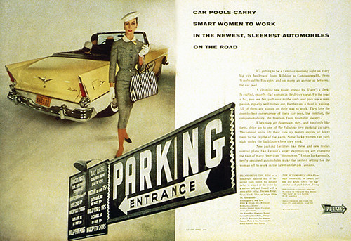
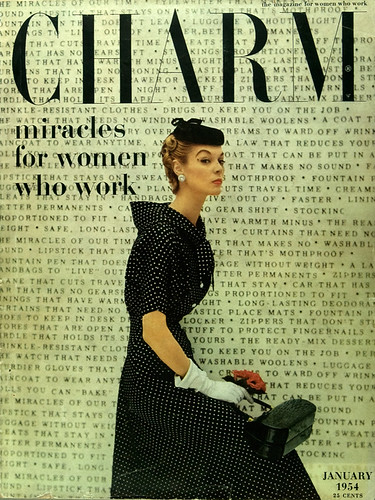
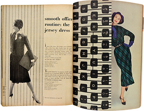
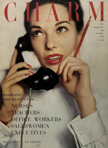
              Although Charm spoke to a cohort of white working women, the magazine touted the broader spectrum of women in terms of occupation, family life, and reasons for working. Feature stories addressed the various opportunities and common challenges facing working women, along with articles and literary pieces written by the era's leading cultural critics, journalists, and fiction authors. While it set high standards for content, Charm also became a conduit for reaching this new market, especially for clothing makers and retailers. Working women required different wardrobes for home, work, evening, and travel and this need for more clothing made them a lucrative market.


              Back in the day, Vogue did not have a set-in-stone cover logo, so Pineles was free to experiment.


              Designs for the Lincoln Centre. Cipe Pineles led the graphics department for the Lincoln Center, supervising the creation of branding and marketing materials for this institution of the arts.


              Clearly, Pineles was with Parsons during the ’70s. Left: Parsons Bread Book (yearbook). Right: Parsons branding materials.

              Fashion story, from Charm, April 1956, uses an atmospheric urban backdrop of cars, a garage and vernacular signage. Photography by William Helburn.


              Typography-dominated cover introduces a theme played out over fourteen pages inside, January 1954. Photography by William Helburn.


              Fashion spread from Charm with office machinery and typing patterns representing work, September 1957. Photography by Carmen Schiavone. 

              Connecting with Charm’s new audience, 19 million working women. Covers featured single women, though not usually ‘at work’; cover lines established the theme, July 1951.

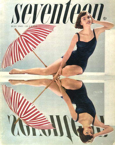
              Cover of Seventeen, July 1949. Reflection in the pool – with a twist. Photography by Francesco Scavullo.

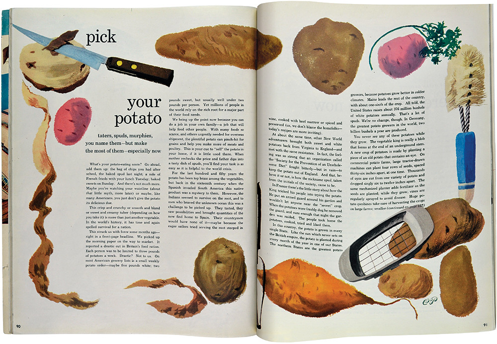
              One of many food paintings by Pineles, sometimes based on her own recipe book. Here she used a first sketch which was fresher than a subsequent ‘finished’ painting.